01 · Hero product view
The product as the hero
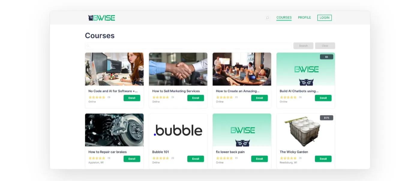
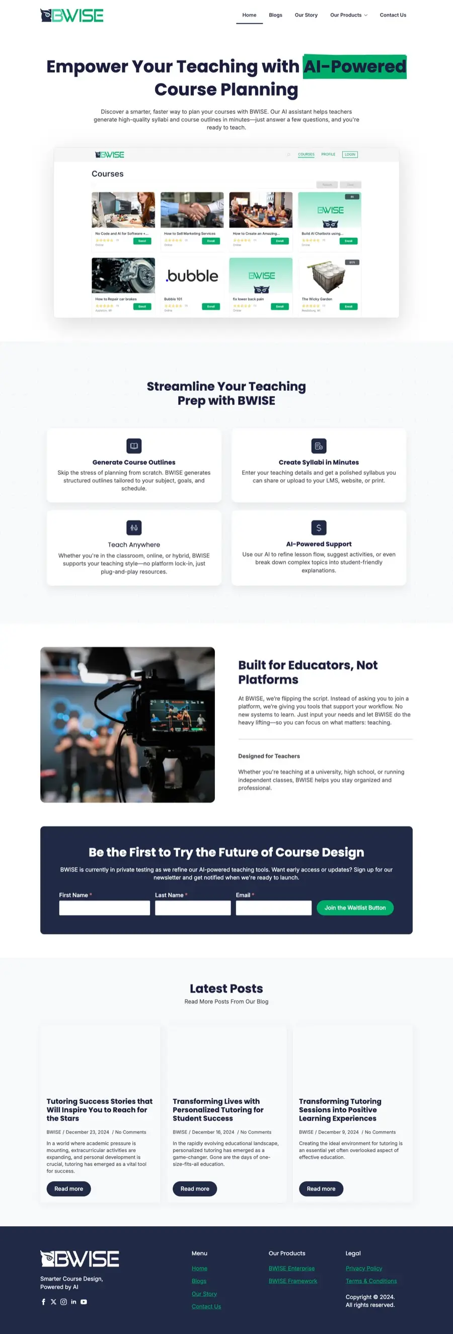
Instead of abstract AI imagery, the hero shows the real course dashboard inside a clean browser frame, so teachers see exactly what they'd be using.
 Contact
A launch website for an AI course-planning tool — built to explain the product in seconds and grow a waitlist before public launch.
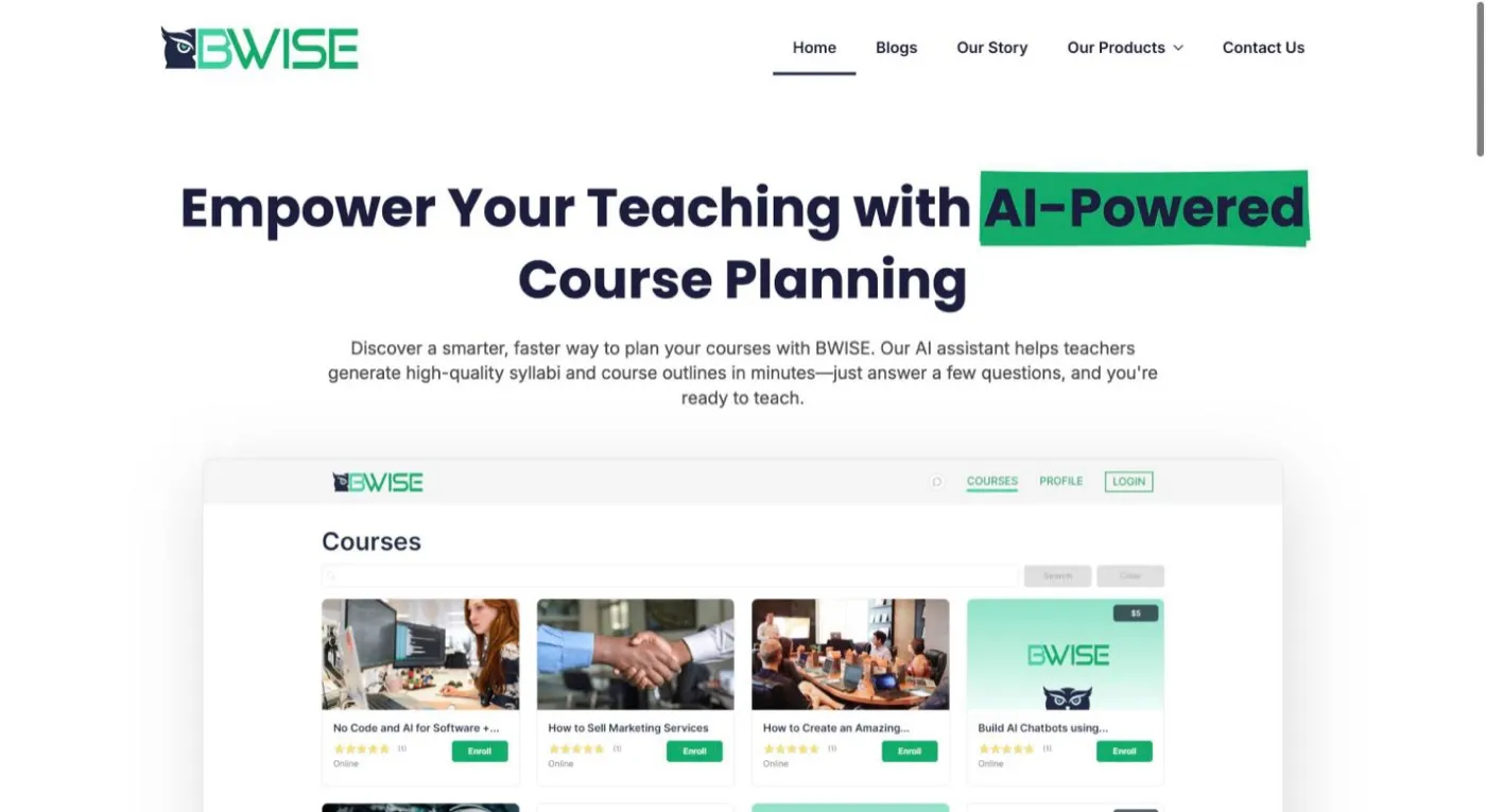
BWISE helps teachers generate syllabi and course outlines by answering a few questions. The product was still in private testing, so the site had two jobs at once: make an AI tool feel trustworthy and teacher-friendly, and capture early interest without a public sign-up to send people to.
We led with the product itself — a real app screen right under the headline — then translated the AI into four outcomes teachers care about. The tone stays plain-spoken (Built for Educators, Not Platforms), and every scroll path ends at a short, three-field waitlist form.
A visitor should understand what BWISE does before they scroll.
Talk about saved prep time and better lessons, not models and prompts.
Turn interest into waitlist sign-ups while the product is in private testing.
Instead of abstract AI imagery, the hero shows the real course dashboard inside a clean browser frame, so teachers see exactly what they'd be using.
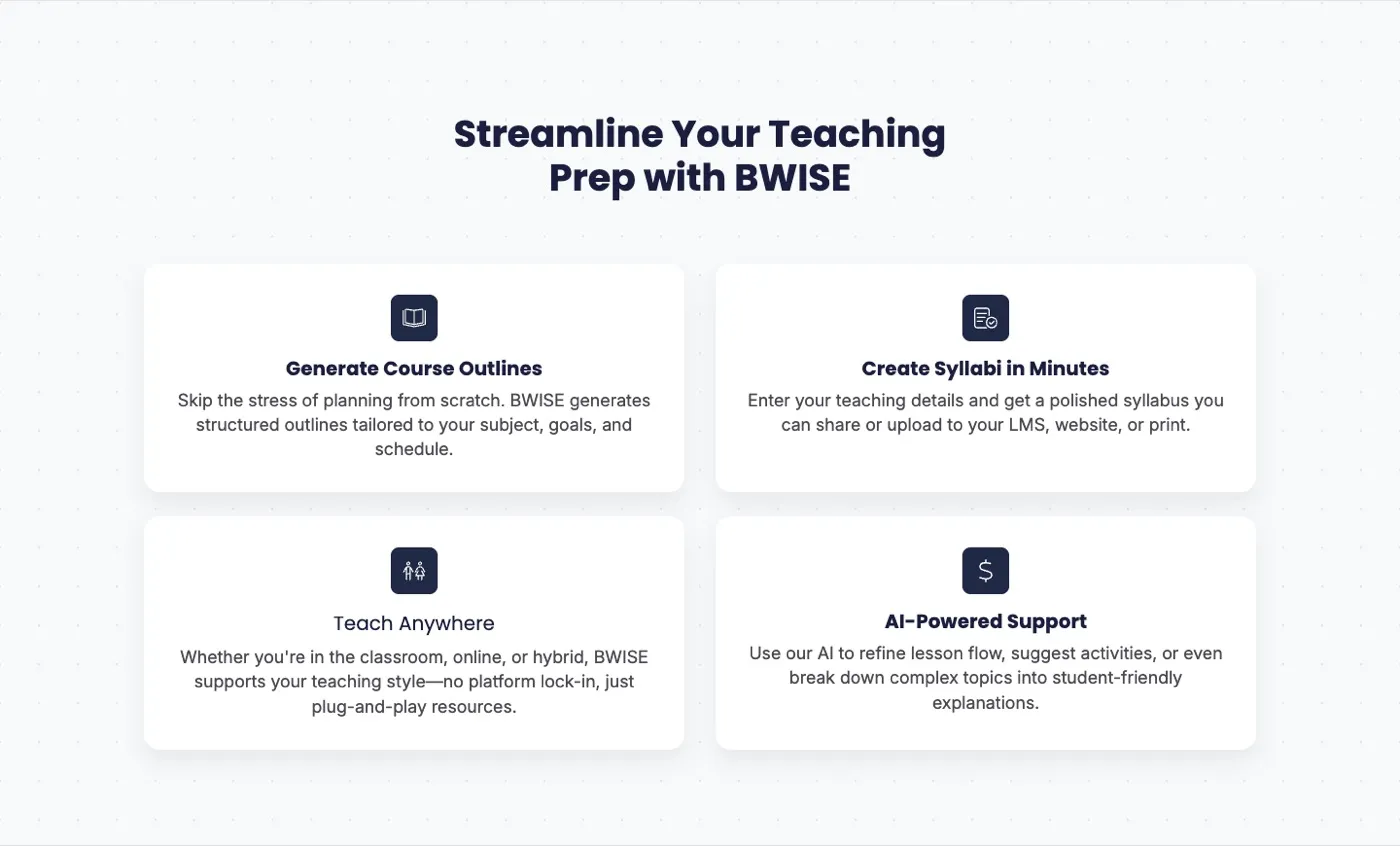
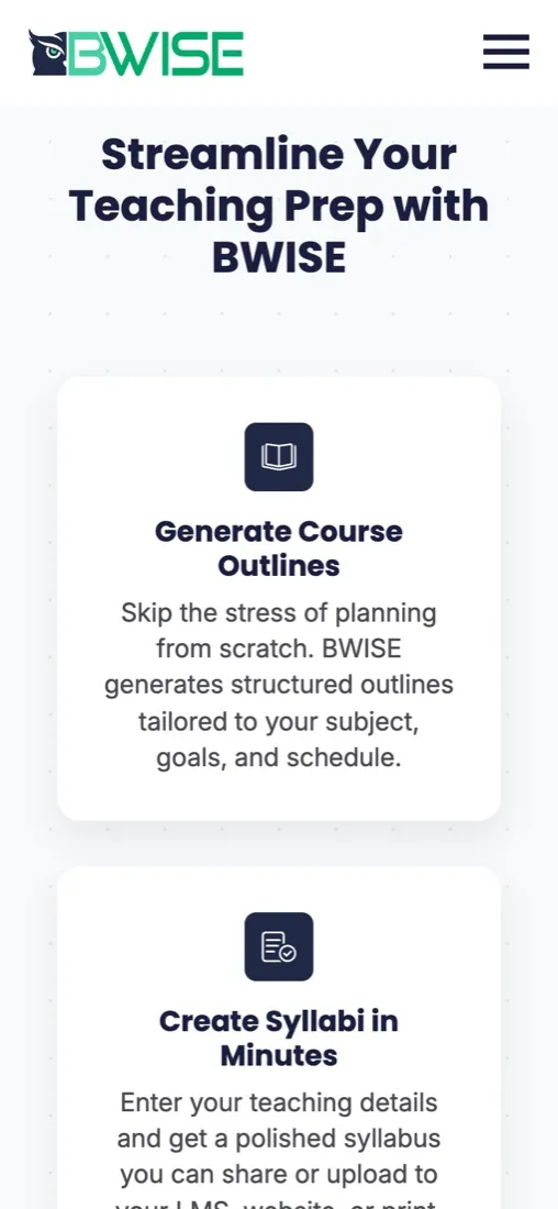
Generate outlines, create syllabi, teach anywhere, get AI support. Each card pairs a simple icon with one benefit in a teacher's own words.
A short brand story — built for educators, not platforms — flows straight into a dark, high-contrast waitlist block that's hard to miss and quick to fill in.

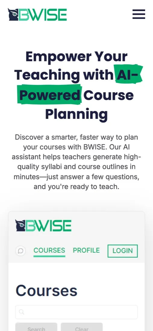
On phones the product screenshot stays in the hero, the feature cards stack into a simple vertical story, and the waitlist form shrinks to full-width fields that are easy to fill in with your thumb.
Pre-launch sites live or die on clarity. Showing the real product and keeping the ask small — three fields, one button — let BWISE start building an audience before launch day.
See it live ↗Let's make something happen together. Book a free 30-min call or drop us a note — we reply within 24 hours.