People who visit Felicity are often anxious, unsure, or arriving at a hard moment. The site had to explain how online therapy works, introduce the counsellors, and cover sensitive topics — from anxiety and depression to trauma and LGBTQIA+ support — without feeling clinical or salesy.
Our approach
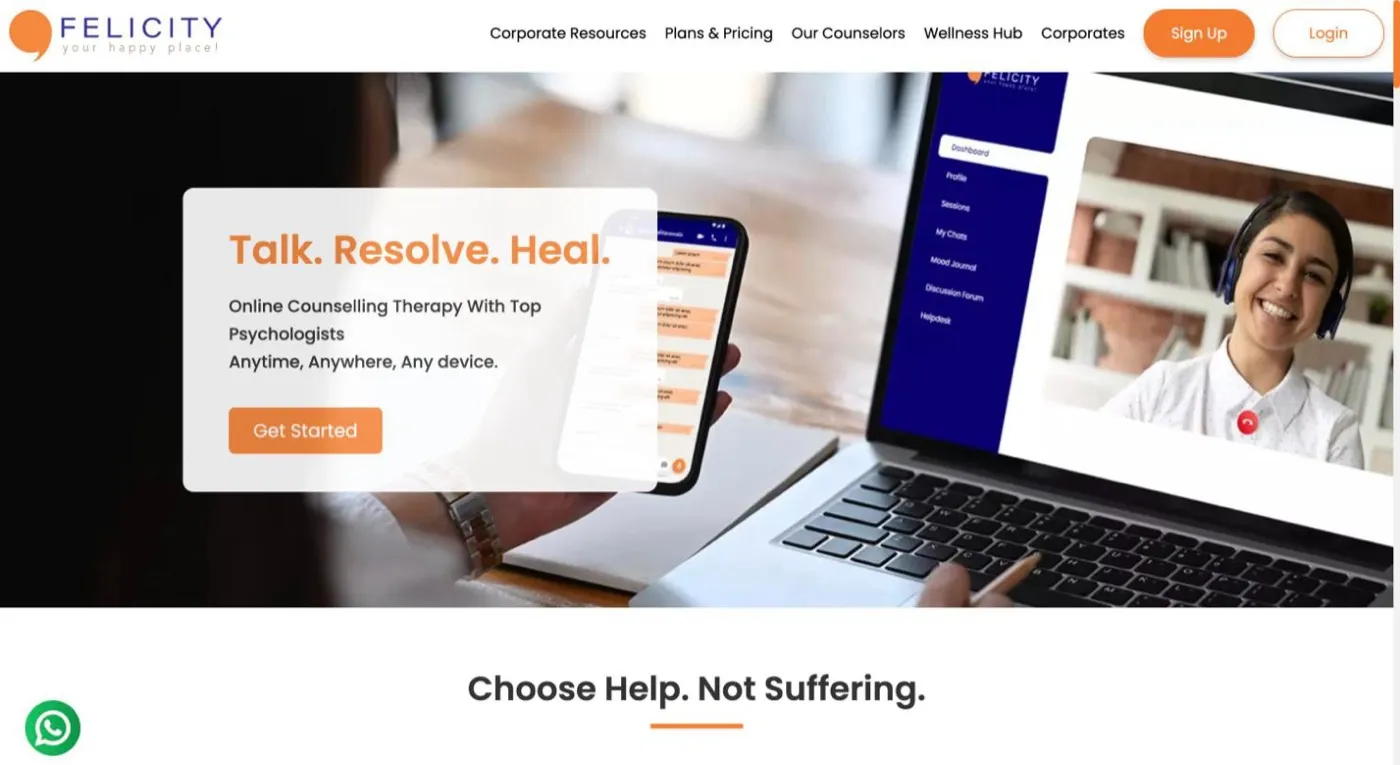
We paired a warm orange with a calm indigo, put real counsellor faces and credentials right at the top, and listed the issues people come with in plain language. A four-step How it works, a free mental-health test and clear privacy reassurance (HIPAA-compliant, 256-bit SSL) make the first step feel small.
01
Build trust fast
Show who you'll talk to, their qualifications and how your data is protected.
02
Make the process obvious
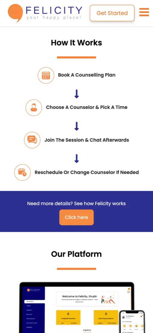
From choosing a plan to joining a session, there should be no guesswork.
03
Offer easy first steps
A free test and a support chat for people who aren't ready to book yet.
(Scope at a glance)
12Areas of specialised help listed
3Ways to talk: video, audio or chat
4Simple steps from plan to session
24/7Support, highlighted near the top
(Design walkthrough)
Key screens & the thinking behind them.
01 · Counsellors
Real people, real credentials
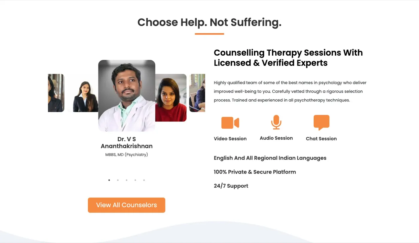
A counsellor carousel leads with faces, names and degrees, next to the three session types and key reassurances: regional languages, a private platform and round-the-clock support.
felicity.care
02 · Specialised help & free test
Name the problem, offer a first step
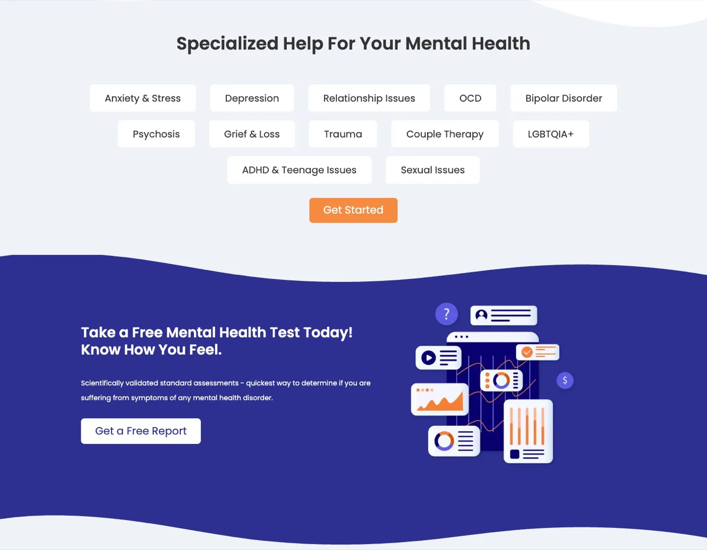
Specialisations appear as simple tags, so visitors can recognise what they're going through. A bold indigo band then offers a free mental-health test as a low-pressure way in.
felicity.care
03 · Our platform
Everything beyond the session
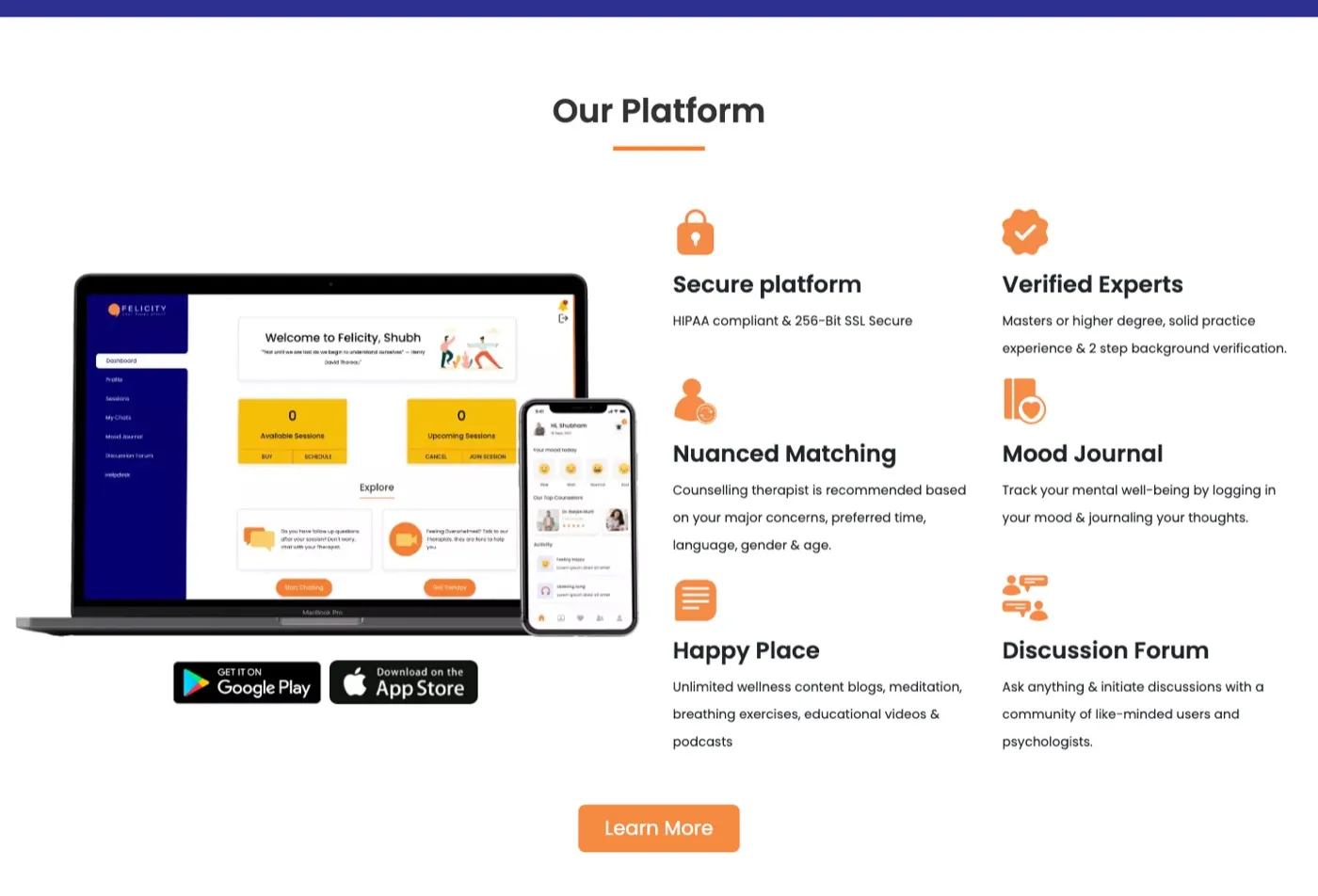
The platform section shows the app across devices and explains the extras — nuanced matching, a mood journal, wellness content and a community forum — in short, friendly blocks.
felicity.care
(Visual language)
Colour & type
Felicity Orange#F47D31
Indigo#2D3091
Soft Orange#F68A40
Mist#EFF2F7
Charcoal#212529
Aa
PoppinsHeadings
Aa
PoppinsBody copy
(Responsive)
Designed for the thumb, too.
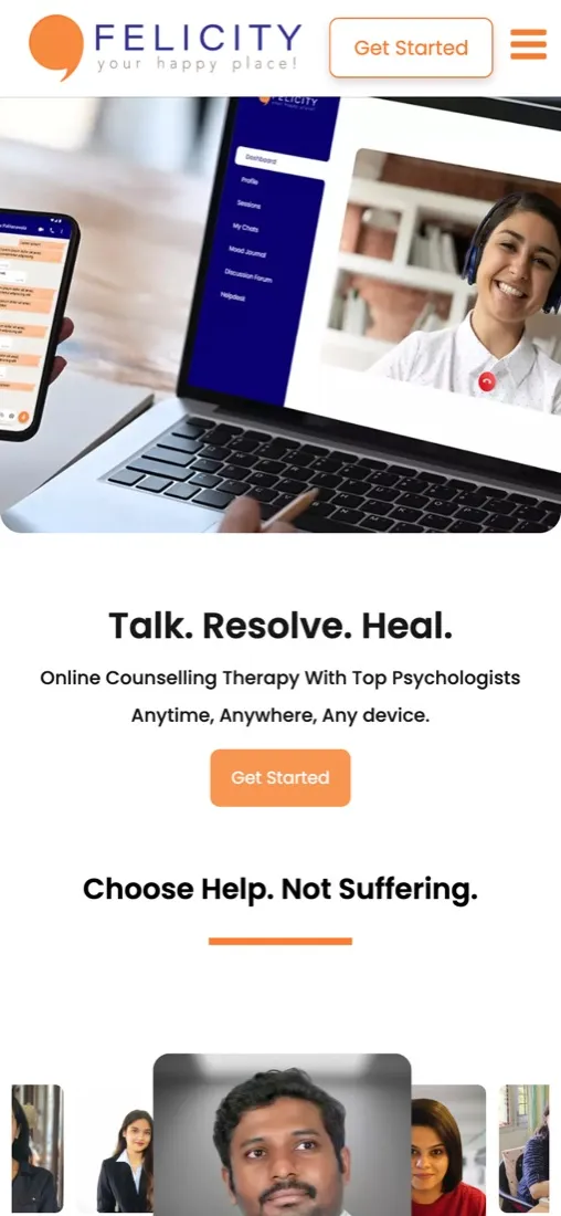
On mobile the hero image and promise lead, the counsellor carousel becomes swipeable, and the four steps stack vertically with arrows — so the path from first visit to first session reads clearly on a small screen.
(The full page)
Top to bottom
Hover to scroll the homepage ↓
felicity.care
(What we delivered)
End to end, design to launch.
Homepage
Counsellor profiles
Plans & pricing
How-it-works flow
Wellness Hub (blog)
Corporate pages
Responsive build
Takeaway
In mental health, design has to lower anxiety, not add to it. Warm colour, real faces and small, clear steps did more for trust than any headline could.